
DOULA APP
UI/UX Design for Doula App
As the lead UI/UX designer, I led the project from research and wireframes to interactive prototypes and final design. I worked alongside my team to redesign our client’s existing e-commerce website using best practices.
Duration:
4 weeks
Tools:
Figma
Lead UI/UX Designer ,
Discovery, User research,
Visual and Motion design, Testing
My role
Lo-fi prototype & Hi-fi prototype
Deliverables:
Summary of User Research
For the UX research phase of this project, we recruited users who already used the app and also we found some new users who fit the criteria of possible end users, created the interview questions, and performed the interviews.
During the UX research, users expressed a need for improved readability within the app and the importance of clear and concise instructions within the app, especially during critical moments such as labor. A recurring theme in the user feedback was the desire for a personalized, calming experience within the app. Users expressed a need for features that promote relaxation.
The problem
Insights found during the interview:
1) Expectant mothers want access to a supportive and informative app that helps them track contractions, provides clear instructions, and promotes relaxation techniques to alleviate stress during labor.
2) Inclusivity for Deaf Mothers: The need for accessibility features, such as visual cues, vibrations, and sign language support, highlights the importance of inclusivity for Deaf mothers.
3) Clarity Enhances User Confidence: Clear and concise instructions are essential for guiding users through critical moments, such as labor, and reducing anxiety
The paint point and how to solve it
Limited instruction during meditation: We have added clear instructions during guided meditation sessions within the app. Additionally, we've incorporated essential features such as play, pause, and forward buttons to empower users to control the pace of their meditation sessions, enhancing their overall experience and usability of the app.
Lack of Personalized Support: We introduced customizable backgrounds with real-time changes to create a calming atmosphere during coaching sessions. Audio controls and a variety of personalization options were incorporated to offer a more tailored and soothing experience. Clear guidance on usage with an FAQ page added to the settings menu was implemented to assist users in navigating and customizing the app with ease.
Unclear Instructions During Labor: Provided step-by-step guidance with visual and audio cues to assist users in navigating the app effectively during labor. Incorporate interactive features such as timers, progress trackers, and prompts for relaxation techniques to offer clear direction and support.
The goal
The design aimed at addressing specific user needs, improving readability, providing clear instructions, and offering a personalized, calming experience, all contributing to an enhanced and user-friendly application interface.
Time for wireframes
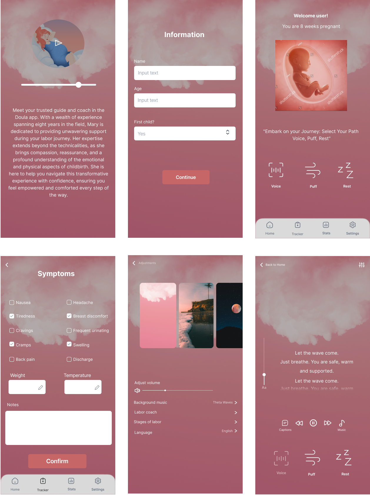
During the wireframe process, our primary focus was on addressing the pain points identified during the User Research. To enhance user satisfaction and facilitate informed purchasing decisions, we prioritized key areas such as the Coaching session, Symptom page, and Homepage.
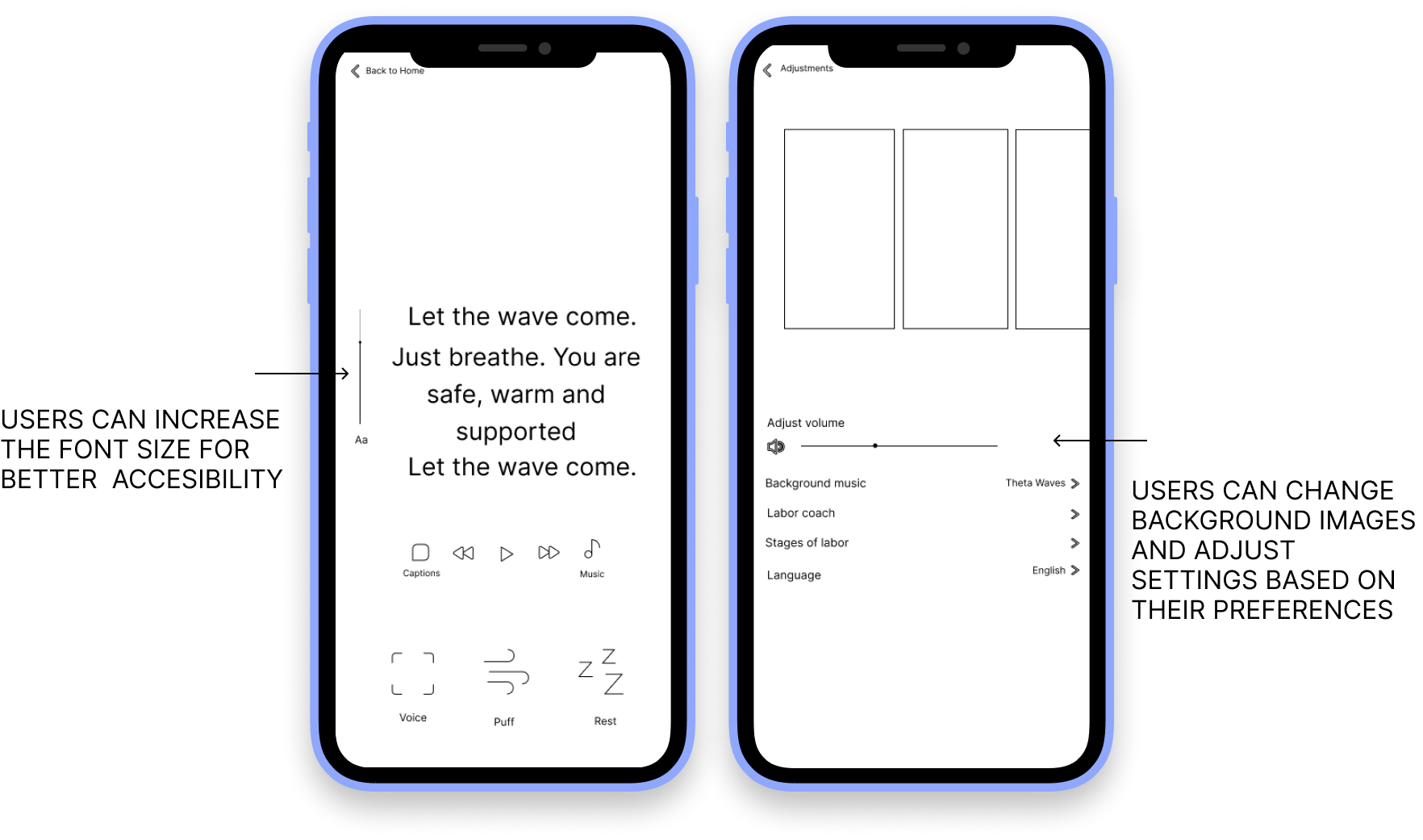
For the Coaching session, we concentrated on optimizing the layout to seamlessly implement a real-time font adjustment feature, offering a range of sizes for a personalized experience and enhancing overall usability, I ensured the persistence of font size preferences across sessions. We also introduced a caption functionality that allows users to enable or disable captions during coaching sessions.
On the Adjustments page, we introduced customizable backgrounds with real-time changes to create a calming atmosphere during coaching sessions. Audio controls and a variety of personalization options were incorporated to offer a more tailored and soothing experience. Clear guidance on usage with an FAQ page added to the settings menu was implemented to assist users in navigating and customizing the app with ease.
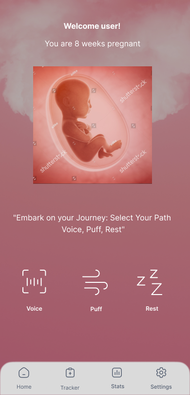
Furthermore, we redesigned the Homepage to feature clear navigation pathways, ensuring easy access to essential sections of the website.
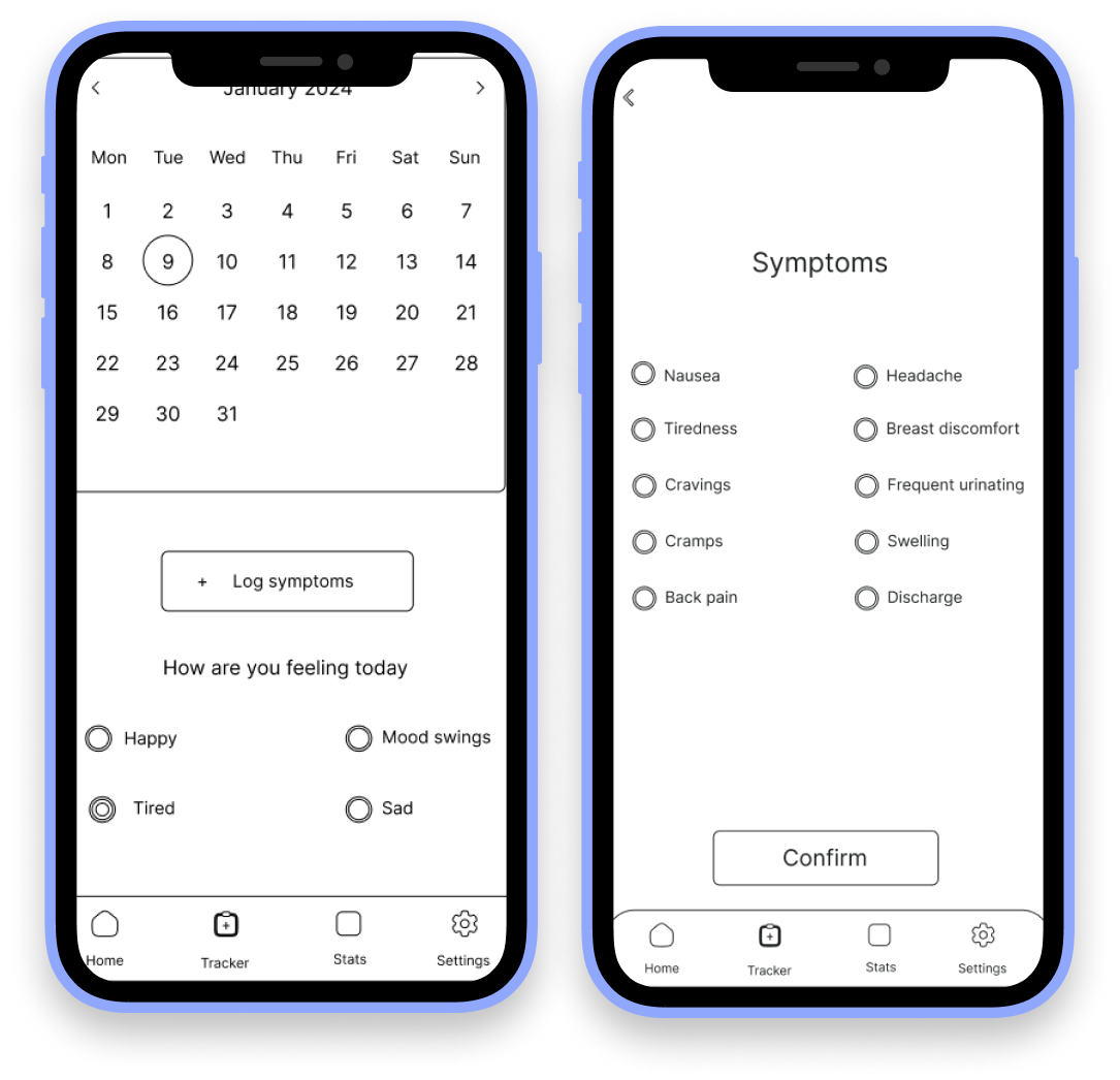
We streamlined the Symptom page to offer users a straightforward pathway for understanding their symptoms effectively. This involved introducing key features such as a calendar, mood selection options, and a dedicated logging page where users can input their symptoms. Upon entry, users are presented with a concise summary of their symptoms per day, providing them with a comprehensive overview of their health status.
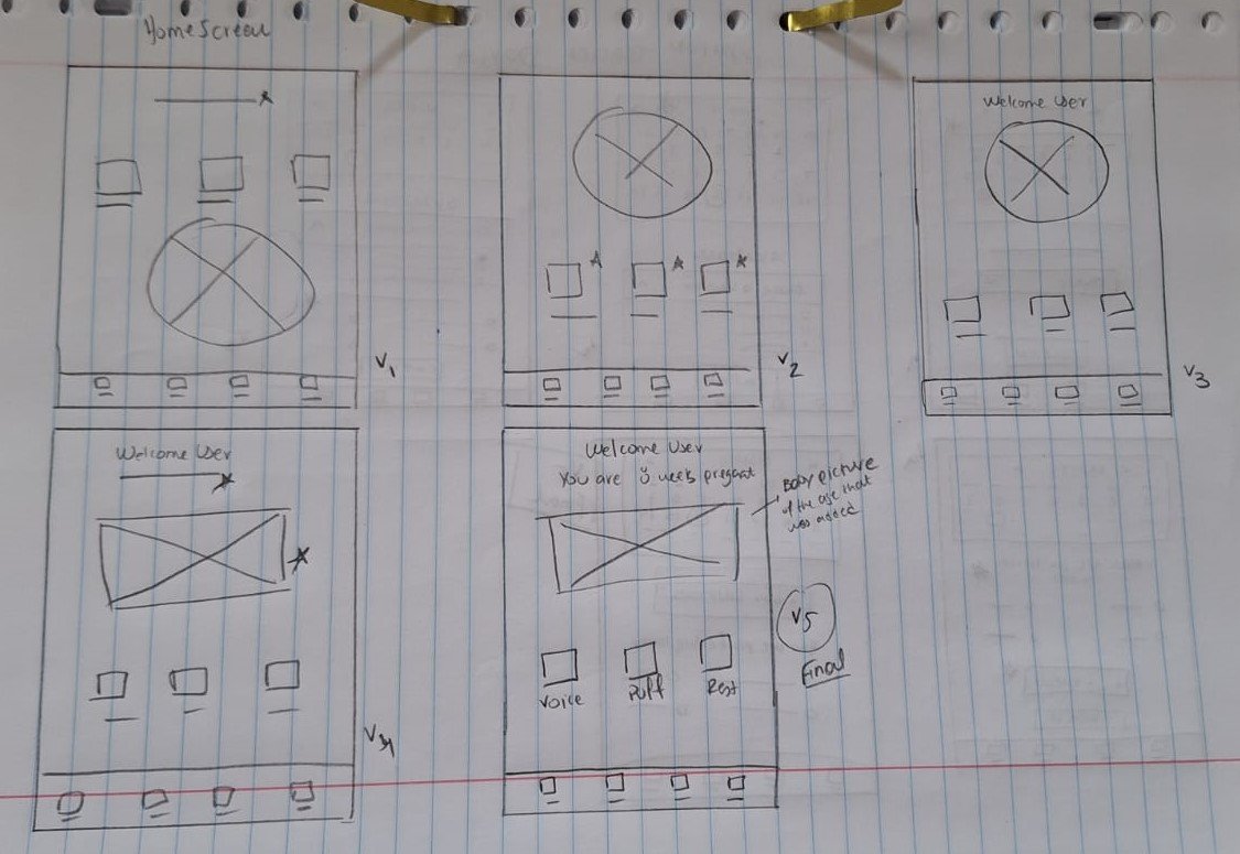


dIGITAL WIREFRAMES
Lo-fi prototype usability findings
I based the screen designs on feedback from user research.
Personalized user intro on the home screen based on users’ data
The ability to adjust background screens, sizes, and volume for personalization and better user experience

Hi-fi prototype usability findings

Following feedback from our customers, it became evident that there was confusion regarding the symptom page's interface, particularly with the use of radio buttons. To address this, we transitioned from radio buttons to checkbox options.
In response to the findings from our usability study, we expanded the fields on the symptom logging page during login. This enhancement includes additional fields such as weight, temperature, and space for further notes. This empowers users to save comprehensive information about their day, facilitating the storage and tracking of their pregnancy data conveniently within the app.

These two points were crucial for the design of WildRide Carrier due to the following reasons:
Clarification on Symptom Selection Interface: This change aims to provide a clearer and more intuitive user experience, allowing users to select multiple symptoms simultaneously without ambiguity. By implementing checkbox selections, we aim to streamline the process and enhance usability for our customers, ensuring a smoother and more efficient symptom tracking experience within the app.
Expansion of Symptom Logging Fields: The decision to add more fields, such as weight, temperature, and further notes, to the symptom logging page was based on the necessity identified through user feedback and usability study results. By incorporating these additional fields, users can save comprehensive information about their day and track their pregnancy progress more effectively.
Μock ups
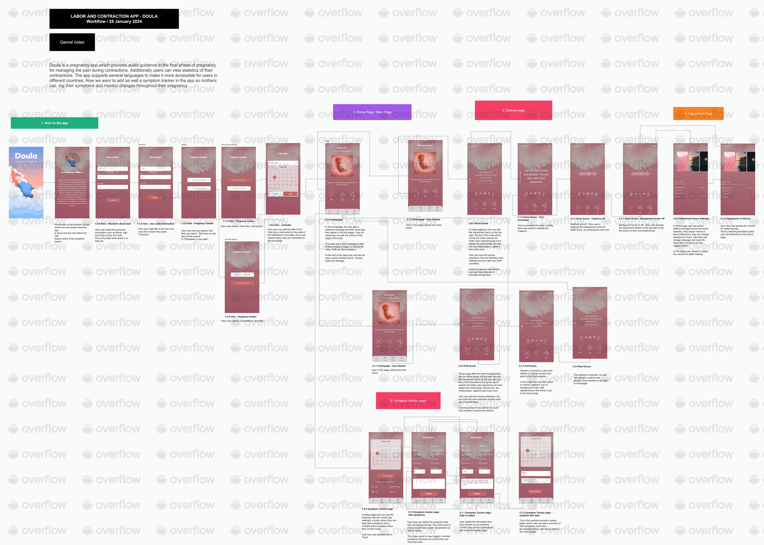
User WorkFlow
Takeaways
Impact: The enhancements made to the Doula App's symptom-tracking interface have significantly improved user understanding and engagement levels.
What I learned:
Through this process, I learned the importance of prioritizing user feedback and iterating on design choices based on user needs. By listening to user input, we were able to make targeted improvements that directly addressed user concerns and enhanced the overall usability of the app.
Next Steps:
One next step I'd like to take is to continue monitoring user engagement and gather further feedback through usability testing. This ongoing iterative approach ensures that the Doula App remains responsive to user needs and continues to provide a valuable and intuitive experience for expectant mothers throughout their pregnancy journey.